
Hey! Sorry for the extended break, both Arcy and I took a holiday which just so happened to line up weirdly. Because of this, there was no poll for the last 2 weeks, so I just chose to write about the 2nd place from the previous poll, 3 weeks ago (wow!).
This will be a short one because my memory is a little hazy on this (I started working on the inventory 5 or so months ago!). Also most of the images will be discord screenshots. Sorry!
The problem (or rather, the desire)
I wanted to have some level of build complexity in the roguelike aspect of the game, beyond just stacking upgrades in a limited number of slots. This, for me, meant to big goals:
Make the player use their brain at least a lil bit
Encourage the player to upgrade all the weapons instead of just putting like 40 upgrades on one weapon and calling it a day (player carries 4 weapons including the gun right)
Surely some game had to have thought of a design solution, right?
Now, finding inspiration was difficult.
Ace Combat upgrades are… boring, really. Just stat changes mostly, and the only upgrades which really change how a weapon worked are that one thingy that makes the main gun automatically aim at targets at close range.
Project Wingman on the other hand had no upgrades whatsoever, and the roguelike mode just had the player gain a bunch of allies to help out instead of improving their own capabilities (not counting metaupgrades, those come later).
No, I was looking in the wrong place. Plane games have been pampered by the fact that in real life you cannot just stick a zweihander on a plane and get a +10 damage buff when enemies are within 300 meters of you. I needed to look at roguelikes.
SEPHIRIA is a game which I fucking love, and it has an incredibly well thought out upgrade system. The player upgrades by gaining and moving around 2 types of objects in the inventory: Artifactswhich provide actual upgrades, and Tablets that improve Artifacts. While this system starts out pretty simple, just place Artifacts wherever and pick nice tablets and place them buffing the most Artifacts at once, at the end of the game the player spends half of their time with a full inventory trying to figure out how to squeeze the final one or two levels out of every Artifact they have. I loved this aspect that made the player really have to THINK.
One small issue though. Sephiria’s player has 1 weapon, while this game the player has 4.
So I couldn’t copy the system directly. I could make something based off of it, maybe something on an inventory grid, but it needed to encourage upgrading all the weapons. After lots of thinking, the inventory was born. This was a YOYOYOLLIE ORIGINAL™, BABY!
(ignore the fact that Backpack Hero may or may not have played a larger role in inspiration than Sephiria, as it does not work for the narrative.)
The nice part about this system is you really can’t stack too many upgrades on one weapon, and squeezing the most out of a single upgrade meant placing it in a spot where it can affect the most weapons. It naturally pushes the player to spread upgrades around.
Plus, even better, it meant “the Package” was an actual gameplay mechanic. It takes up space in the inventory, gets in the way, and is just an all around hinderance. It was no longer just a lore item the player must deliver! Complete
Iteration, iteration, iteration
Just like with all things gamedev, it’s never that easy. This system presented lots of challenges: Namely, visuals.
The issue with this was it was going to be a screen the player would spend a lot of time staring at. It’s gotta look good, but it’s also gotta be readable. And most importantly, as I am lazy as fuck it needed to be easy to make Modules for (yes we call upgrades modules). Though, I had one idea for the style:
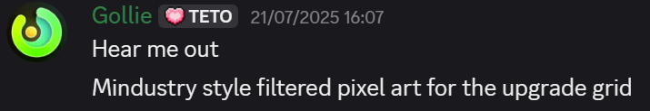
You might be wondering what this is, and guess what? You get to keep wondering because I am not explaining it here.
(Its basically just a way to upscale pixel art, but it produces some pretty nice sprites which fit well with the style of the UI!)
This filter was actually translated into a shader graph node for me by REDLINE (no, not the music from Project Wingman Frontline 59, I mean the guy who’s currently running the TEAM BATTLE on the server)! He’s also using it for his own game, Umblight, for the cards.
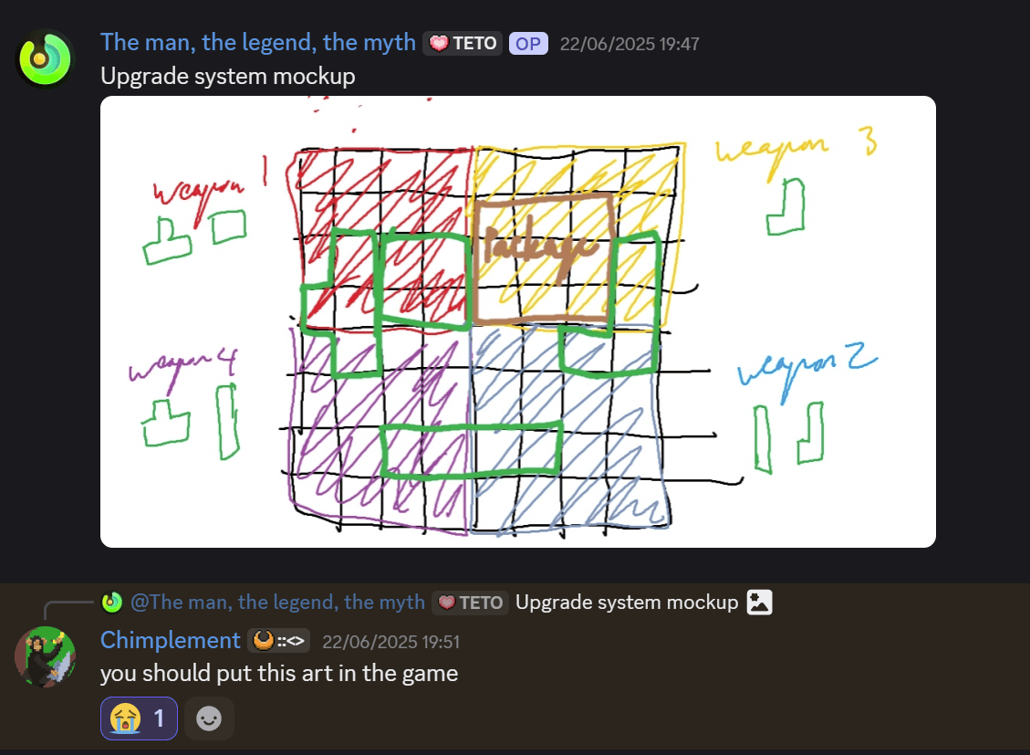
It still had issues with style though, this was my first ever mockup of how the inventory could potentially look:
It was a lot more “UI focused” and non-diegetic than how it is nowadays. I didn’t like this, since it felt… cheap? It was just very disconnected from the world. I felt like for the player to really feel like they were physically upgrading their aircraft, it needed more than just non-diegetic UI. Deciding on how it should actually look still took lots of iteration though, and I even wound up forgoing the whole pixel-filtered style for a retro PDA aesthetic at one point
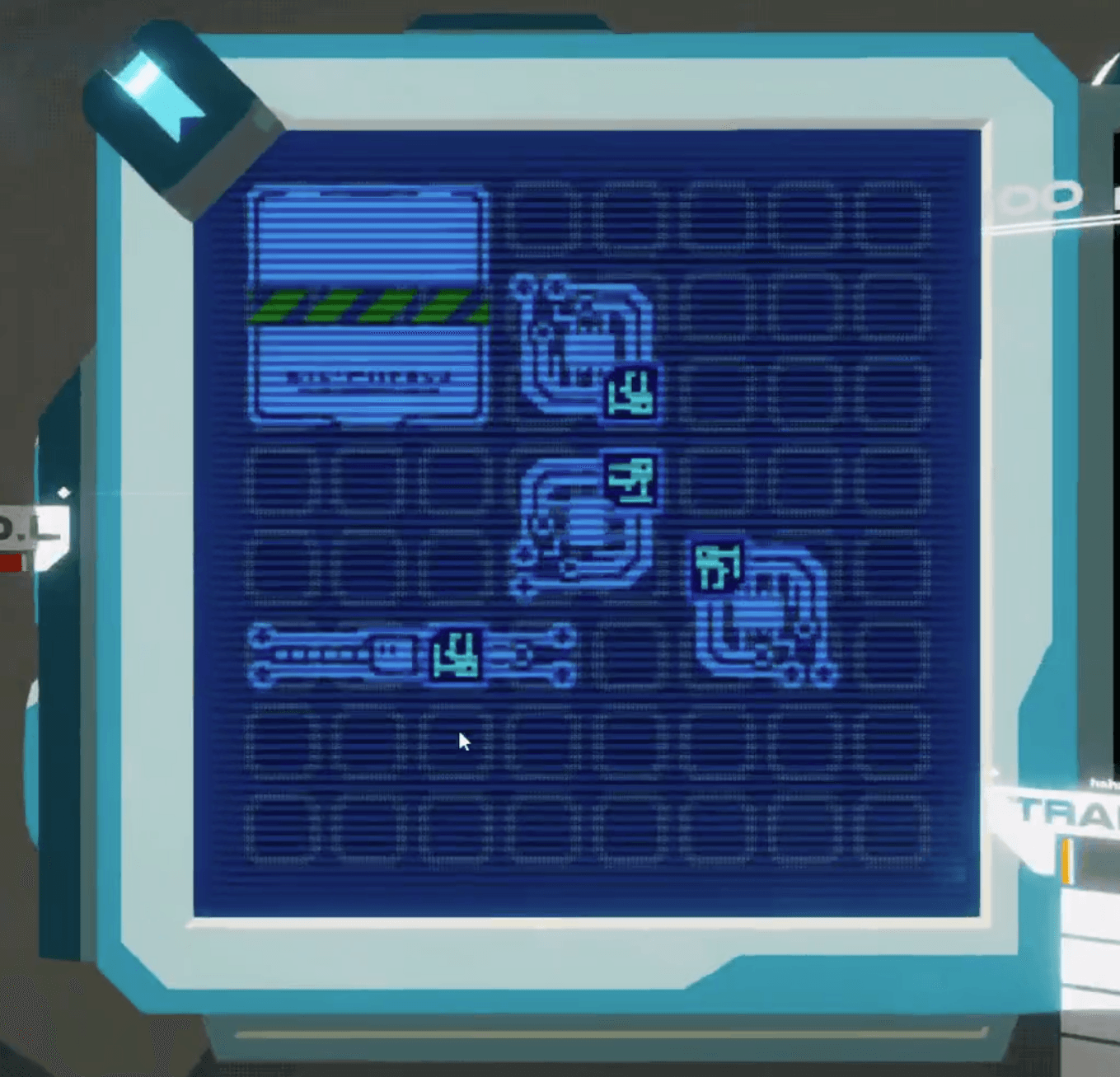
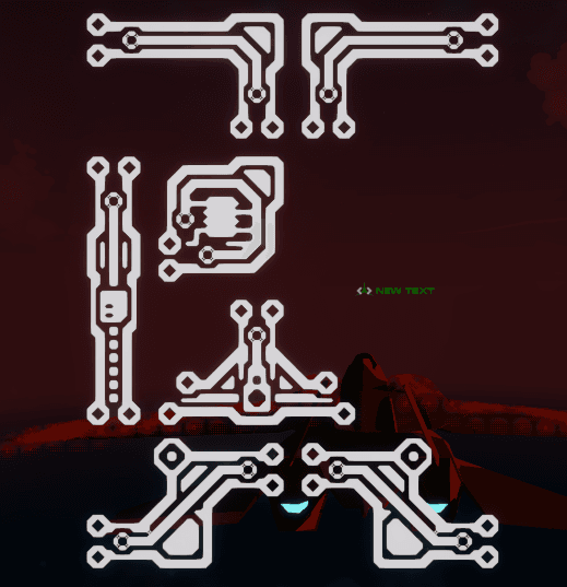
Eventually I came to the current look in the game today, though, this is also subject to change because I’m not fully happy with how it looks compared to the rest of the game.
Now, like the curious people you are you might be wondering, huh?? what was that at the start of that gif???? Well sorry. Because I am saving that for a later blog post. I am lazy (I’m already a day late for this post ok give me a break I can’t write an essay for every week)
That’s all for this week!
Sorry for the short post lads. Most of the stuff I’m working on and towards for the game right now are things I can’t share until much later when they’re all finalized. Additionally, something happened which, despite being a good thing, I did NOT plan for and required us to rework our plans for March. Welp.
Though, because of that, there’ll be an announcement soon… ish. Nothing special, but yes this is indeed an announcement for an announcement. See you in 2 weeks for the next blog post! …Or right after this one releases, on the Discord!